outside the frame is thinking about and making art “outside the box” By exploring art and experimenting with media, paints, styles and technique
Showing posts with label exploring art. Show all posts

Saturday, July 3, 2010

A Study of De Stijl and the Piet Mondrian style of painting

Over the years I have come across a number of De Stijl style painting in various galleries, usually by Piet Mondrian and although I understand that as an art movement the De Stijl group has an important part to play in modern abstract painting, I have never fully appreciated or gained from my exposure to this style of painting. It just seams to lack feeling or passion as it dose not provoke a reaction in me.

The De Stijl art movement developed during the first world war, Dutch artists isolated from the rest of the art world due to the Neutrality of the Netherlands during this conflict began exploring New art and founded the De Stijl art movement.  Artist such as Piet Mondrian, Theo van Doesburg and Bart van der Leck all experimented with this style for several years.  Mondrian named the movement (Neo-Plasticism) However today we commonly refer to this artistic technique as De Stijl, meaning “The Style” which was the name of the journal published by Doesburg about Neo-Plasticism. The De Stijl philosophy proposed total simplicity and abstraction using only straight horizontal and vertical lines and limiting themselves to the primary colours, red, blue and yellow and  three primary values of black, white or grey.


A painting in the style De Stijl
#30 acrylic paint on paper
9 x 9 inches approx


As part of my ongoing study into art and the different ways to make art I added De Stijl to my list, partly as a method of discovery and understanding this particular artistic group but also to expand my own visual vocabulary and although as you can see in this piece I did not fully follow the principals of the De Stijl, I still feel that I gained a great deal from this painting.  I freely admit that I am not totally happy with the colours mixes that I made or the level of care in its execution as some of the lines are not as strait or even as they could (should) be which I feel lets down the panting in terms of composition it is however a good start and has proven that further work in this area will be of huge value.

In conducting my research I discovered a number of sources that threw a huge amount of light into the De Stijl art movement and the lives of its principal artist such as Piet Mondrian which I found very helpful and have included these links for your interest which I am certain you will find of great value.

Mondrian / Wikipedia, the free encyclopedia

Empty Easel The De Stijl Art Movement

The tate.org

Saturday, May 29, 2010

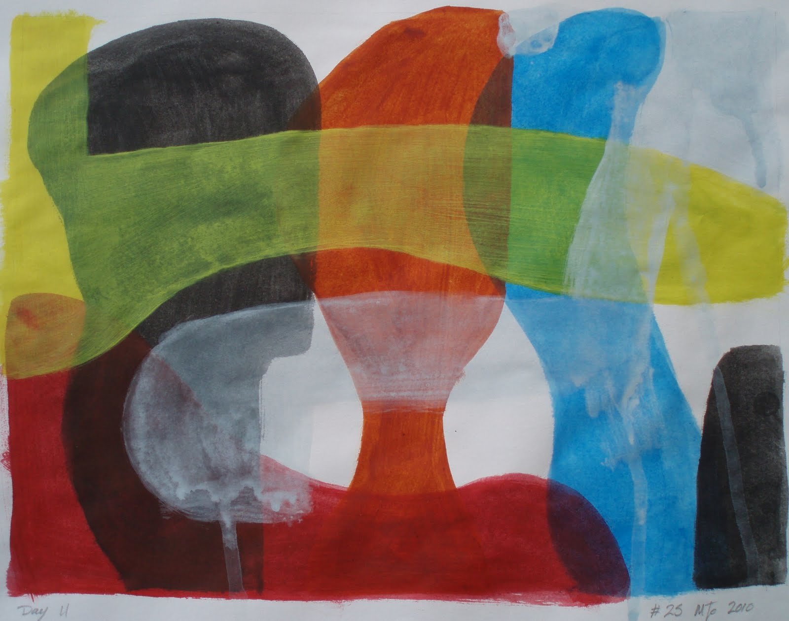
Colours competing for attention

On occasions It gets noisy in my house once in awhile what with all the girls shouting and making a fuss all trying to be heard over the din of the others…it is like Colours competing for attention I escaped to the relative sanctuary of my studio only to find it following me… Gerrrrr… as a result I took several deep breaths and calmed myself as I started this piece.

Using acrylic paints applied to paper in thin washes, with only a rough idea in my head  I painted bold shapes that overlapped. As much as anything I was exploring the media and the colour vials that resulted. It did not quite work as planed that’s not to say I had a plan only the paint did not run or drip as I expected. I was also disappointed with the coverage and the relative blandness of the paint… Almost as frustrating as living in a house full of women. But that however is my choice I suppose.


Colours competing for attention
#25 acrylic paint on paper 9 x 12 inches approx

That is not to say that I do not think that this is a successful painting It’s just that I was struggling with the media more than I would if I had been using oil paint. Please let me know what you think.

Wednesday, May 26, 2010

Art is an act of destruction

Making Art is in essence a process of destruction! In effect changing one image to create another means destroying the previous image. One way to do this is to distressed/damage the painting which forms number 30 on my list of simple and interesting painting ideas. In this case I splashed household bleach over Marker pen and acrylic paints. The effects where both interesting and unexpected. The bleach did not behave quite the way that I had envisioned in some places it fully bleached the paint while in others it just altered the colour or had limited effect while on the marker pen it left a brown stain of varying degrees. 
 

#23 9 x 9 inches approximately 
Marker pen and acrylic paint painted on paper


#24 Ink and acrylic paint on paper   
9 x 9 inches approx, Mixed-media on paper


In the piece (#24) I used Marker pen, conté crayon, charcoal, acrylic paint, oil pastel and bleach. In the areas that I applied conté crayon or charcoal I found that these media did not adhere to the surface, remaining lose and unstable.  Like  #23 I had made a decision to distress the paint with bleach, which had some unexpected results. The bleach is difficult to control as the effects are uneven and varied but interesting and worthy of further investigation.

Note: the bleach not only affected surface but permeated through to up to 5 sheets of paper below altering the colour and texture of the paper itself.

please leave a valued comment which is always appreciated thank you!

Sunday, May 9, 2010

Ink painted on paper

I don’t normally use inks in art however in this case I felt that it was about time I made some efforts to try this medium. As with all permanent markers be that ink or pen there is a need to be confident and decisive in their use… as mistake and errors are difficult to rectify.

As you can see I chose to use a complex and difficult image to start this study in inks, by using a photo for the basis of my subject. I must admit that I initially struggled with this piece but found it very rewarding even if it did take longer than expected. Using a brush I applied thin layers of ink to the wet paper, without any initial drawings or outline. I used a normal writing Ink rather than artist inks which I did find most refreshing and was surprised by the range of colour that this black ink produced ranging from brown, blue and varying shades of grey. This however was difficult to control despite playing with varying levels of dilution and layers. please feel free to leave your valued comment which are always appreciated.

#18, Ink on paper, 9 x 9 inches approx
Ink painted on paper

Sunday, April 25, 2010

Black marker pens for sketching

#14
Modern abstract mixed-media artwork, 9 x 9 inches approx
Acrylic paint, maker pen, charcoal and sketching crayon/pastel on paper
I have often used Black marker pens for sketching and exploring ideas in line and form as it is both a liberating and restrictive media that forces you to develop confidence and consider the value of the single line or mark in art.

In this case I used Marker pen over acrylic paint.. I don’t normally use Pink as I feel that it is a cold and lifeless colour almost as bad as black.. However The black marker brought the pink alive and intensified the black…The marker pen has a glossy feel that seams to hold a thousand colours. Very interesting. I added charcoal and the pastel to look at the what else could be done … unfortunately they do not adhere to the maker pen areas well, remaining loose and dusty.. Perhaps I should try adding these while the marker pen is still wet ? If you have tried this I would very much appreciate you comments.

Painting a better picture

#13 Mixed media painting/drawing
9 x 9 inches approx, Oil pastel, water colour and acrylic paint on paper

Being a big fan of all things BAUHAUS I decided to produce this work with that in mind.. Having no initial concept other than considering the work of Lyonal Feininger and Paul Klee I allowed myself an hour to complete this art study.
Oil Pastel is not a medium that I like or enjoy working with as I have often felt that lacks subtlety and finesse… However with this piece I applied several rough layers and with some heat and used a tissue to blend and smooth the colours crating a subtle base… The water colour and acrylic paint was added to test the effects.. The water colour was repelled far more than the acrylic but still made some interesting effects, with some fine lines that have a broken and bobberly feel or a thin textured wash… # 13, Unlucky thirteen not a chance that’s right…. as I feel very pleased with this piece, but please let me know what you think and leave your comments.

Wednesday, April 21, 2010

Acrylic paint on paper in the style of Franz Kline

#11 Modern abstract painting, 9 x 9 inches approx, Acrylic paint on paper

The Third piece Painted in the style of Franz Kline. Using a different approach I found that I Struggled with this painting far more than the previous two… I think it has more to do with composition than anything else… This one is far more considered at the cost of what I feel is a loss of energy. Please leave your valued comment which is always appreciated and very helpful.

Thursday, April 15, 2010

Kline style Modern abstract painting

Painted in the style of Franz Kline #9 (9 x 9 inches approx.
Acrylic paint on paper
) is an abstract expressionist painting that sets out to capture and understand his approach to modern action painting.
Making a decision to explore Kline’s calligraphic technique, The hard part for me in this painting was painting the white… Franz Kline himself pointed out when asked about his black paintings said  “I paint the white too”.  Despite being termed action painting he worked from compositional drawings and studies, often executed on the pages of old phone books which he referred to often throughout his process.

I however did not make a parliamentary drawing, I just let myself go blank and let the painting happen. as I got close to finishing I Just felt that it needed some colour and even this small amount of colour, I feel enlivens and deepens the piece. although I have to admit that getting the right colour of white might have made a difference. Please feel free to leave your comment on what you think !

Wednesday, March 31, 2010

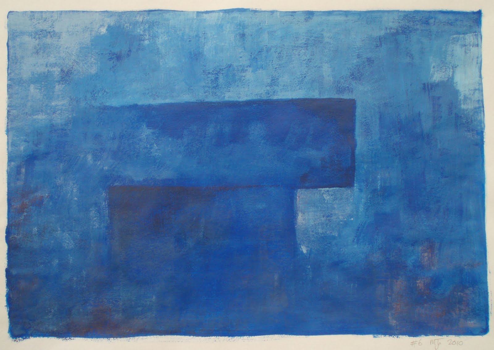
#6 Modern abstract painting in blue

Following on from the previous painting (painting #5) I again set out with no clear idea of what I wanted to paint other than a basic notion. Painted quickly as a simple monochrome painting of blue acrylic paint allowing myself half an hour to complete the piece. However I soon felt that the painting needed some definition and  added a touch of red to deepen shade and provide contrast. The broken finish is a result of the hasty brushwork but seams to add to the overall feel of the piece.

#6 Modern abstract painting
9 x 13 inches approx
Acrylic paint on paper

No clear idea, Is that a good thing?

I started this piece without any clear idea of where I wanted to go with it and as a result I soon found that I did not like the direction that it seamed to be heading. I have to ask myself, Is it of any value to have a clearly defined idea before beginning or should I simply guide the process and see what happens, allowing a painting to come about of its own accord ?

Making decisions and trying a novel approach to things is in part what this whole art project is about.  In this case I tried the latter. So I splashed and splattered paint across the painting and added pencil to provide definition.  OK, Its nothing special but is it a complete mess or did I save it ! Let me know what do you think I would be very interested.
#5 Modern splattered painting 
9 x 9 inches approx Acrylic paint and pencil on paper

Sunday, March 28, 2010

Acrylic on paper

A simple abstract modern painting exploring shape and form. This painting was taken from a rough sketch in one of my books, that I have not had the courage to commit to canvas as yet. The simple fact is that I was intimidated by the amount of space within the picture and yet its simplicity and visual openness seams to work very well… I have got to overcome these innate fears of mine!

This art project is all about overcoming fears and exploring ideas and if I consider the results of this piece alone then I am already one step closer to being a better artist and painter…
#4 Modern abstract painting
Acrylic paint on paper 9 x 9 inches approx
Painted in blues because that is what I had out at the time and this seamed to feel right, I allowed myself an hour to complete the painting, nevertheless I overran by 15 minuets but I am not going to kick myself for that, as I think that it works quite well, but on reflection I think it needs a touch of colour perhaps red? And some more exploration as an idea or concept.

This is one of a number of sketches Drawn after stopping at a Neolithic walkway we found on Dartmoor on a cold wet misty day a few years ago. I have tried to capture the feel of the long lines of standing stones, fallen, missing, buried, large and small. The magic and mystery that these ancient places seam to hold is at time quite breathtaking, when one considers that they possessed none of the machinery or technology that we so often take for granted today.

#3 Modern abstract painting

#3 monochrome painting
Acrylic paint on paper
9 x 9 inches approx
Ultramarine monochrome abstract painting. This is not the sort of thing I normally paint, but it forms part of an ongoing art project exploring art, colour, shape, form and texture through as wide a range of artistic media and styles. Monochrome is a style of painting that explores the purity and emotional effects of a single colour.

The value and impact of colour to the human mind is at times difficult to understand as each of us perceive colour in distinct ways that draw on personal and environmental experiences and as a result creating differing emotional responses within the mind of the viewer.

Blue is without doubt the favourite colour for both men and women, invoking  deep feelings of calm, dependable, serene and sedate as it is the colour of the sky and what we think is the colour of the sea. However some bright blues appear to express excitement and vibrancy while other shades of blue might feel cold or lifeless. Indigo might encourage the viewer to become pensive or self-aware as it has a quality of mysticism and profound knowledge. As artists handling and understanding the values and complexities of colour beyond those of mere contrast is vital.

With this painting I was stuck by the compositional similarities to #1 despite being  painted some time later and without reference to the earlier piece.  Is this a subliminal or psychological process within me? which is perhaps something I should consider and explore further. Although not a big fan of acrylic paint I was however, impressed with the intensity and energy of the ultramarine blue.