outside the frame is thinking about and making art “outside the box” By exploring art and experimenting with media, paints, styles and technique
Showing posts with label artwork. Show all posts

Thursday, July 1, 2010

Colourful and simple abstraction

Making art dose not have to be complex or difficult! Even simple patterns or shapes can convey all the atmosphere, interest and energy required to make any painting successful. The simplistic or childish image can hold a power and intercity of colour that goes far beyond what we might expect. Colour alone has a deep and meaningful part to play in the physiology of the human mind, invoking emotional responses in individuals and this is a fact not lost on many famous artist and painters in the modern world.  The work of artists such as Mark Rothko, Barnett Newman, Robert Motherwell, Josef Albers and Henri Matisse to name a few, all understood the value and impact that colour has in its own right.

In this particular piece I chose to explore a simple arrangement of contrasting colours, being bold and decisive I worked roughly with the oil pastels smoothing and softening it with my fingers. I developed the blending further by applying some heat from a hairdryer much to my girlfriends annoyance latter I added a some white acrylic paint to the bottom as means of creating further contrast and texture and was surprised that the acrylic paint picked up some of the colour subtly tinting the white paint as I did not expect them to mix.

Although I do not normally enjoy working with oil pastels I occasionally use them for rough compositions and colour studies  I do feel that this piece dose work quite well as the texture of the oil pastel enhances this piece effectively. please leave your valued comment and let me know what you think.


A simple abstract artwork 
#29 oil pastel and acrylic paint on paper
9 x 9 inches approx

Saturday, May 29, 2010

Colours competing for attention

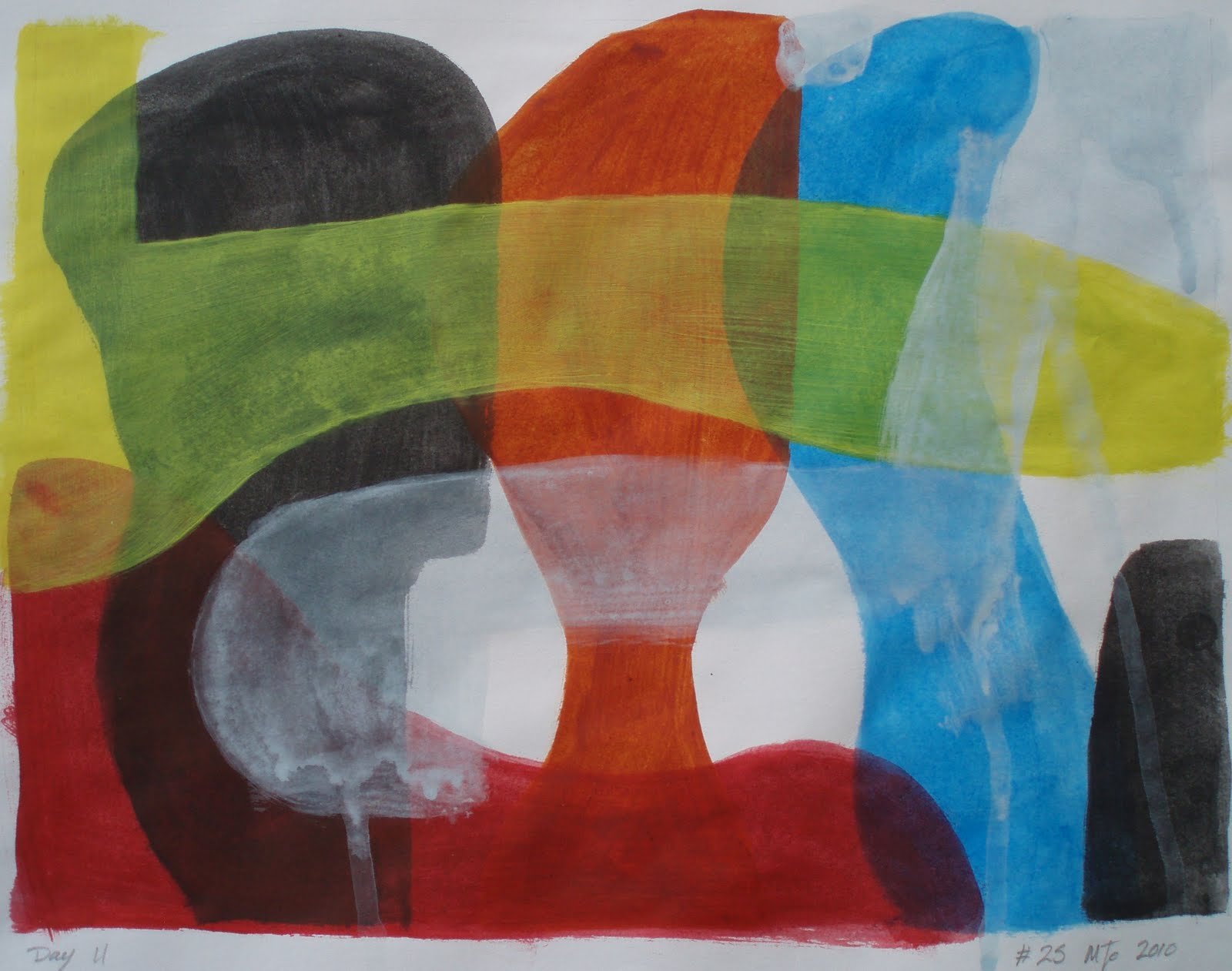
On occasions It gets noisy in my house once in awhile what with all the girls shouting and making a fuss all trying to be heard over the din of the others…it is like Colours competing for attention I escaped to the relative sanctuary of my studio only to find it following me… Gerrrrr… as a result I took several deep breaths and calmed myself as I started this piece.

Using acrylic paints applied to paper in thin washes, with only a rough idea in my head  I painted bold shapes that overlapped. As much as anything I was exploring the media and the colour vials that resulted. It did not quite work as planed that’s not to say I had a plan only the paint did not run or drip as I expected. I was also disappointed with the coverage and the relative blandness of the paint… Almost as frustrating as living in a house full of women. But that however is my choice I suppose.


Colours competing for attention
#25 acrylic paint on paper 9 x 12 inches approx

That is not to say that I do not think that this is a successful painting It’s just that I was struggling with the media more than I would if I had been using oil paint. Please let me know what you think.

Sunday, May 9, 2010

Ink painted on paper

I don’t normally use inks in art however in this case I felt that it was about time I made some efforts to try this medium. As with all permanent markers be that ink or pen there is a need to be confident and decisive in their use… as mistake and errors are difficult to rectify.

As you can see I chose to use a complex and difficult image to start this study in inks, by using a photo for the basis of my subject. I must admit that I initially struggled with this piece but found it very rewarding even if it did take longer than expected. Using a brush I applied thin layers of ink to the wet paper, without any initial drawings or outline. I used a normal writing Ink rather than artist inks which I did find most refreshing and was surprised by the range of colour that this black ink produced ranging from brown, blue and varying shades of grey. This however was difficult to control despite playing with varying levels of dilution and layers. please feel free to leave your valued comment which are always appreciated.

#18, Ink on paper, 9 x 9 inches approx
Ink painted on paper

Wednesday, April 21, 2010

Acrylic paint on paper in the style of Franz Kline

#11 Modern abstract painting, 9 x 9 inches approx, Acrylic paint on paper

The Third piece Painted in the style of Franz Kline. Using a different approach I found that I Struggled with this painting far more than the previous two… I think it has more to do with composition than anything else… This one is far more considered at the cost of what I feel is a loss of energy. Please leave your valued comment which is always appreciated and very helpful.

Friday, April 9, 2010

Numbers #7 and #8

Moving on from painting #2 which was a simple monochrome abstraction painted in cerulean blues. I felt that pink would enliven the blue, further adding dimension to an already interesting colour and pursued this by following a minimalist approach. 


Initially I intended to further develop the piece with other media however number #7 (upper left) proved reasonably successful as it stood. Number #8 (upper right) was painted immediately after #7 making a few adjustments to its minimalist composition I then added a light wash which I allowed to run down the surface and along with pencil and oil pastels. this piece feels better and more exciting as an purely abstract painting. Both pieces took less than 30 minuets each to complete which was well inside the time that I had allowed.

The observations I have made is that thinning the acrylic colour presents some difficulties. To make the paint thin enough to run dilutes the paint to much thinning the pigment, perhaps I should look at a way to reduce the surface tension either by wetting the surface first or adding some agent to increase the flow of the paint.  

What is Surface tension ?
Surface tension is the visible effect liquids have when the molecules in a liquid stick together in drops,  this is caused by the attraction of the liquid molecules to each other. Because those molecules on the edge or surface are not surrounded they attempt to withdraw creating the necessary cohesive force that make a drop rounded. Other factors such as air-pressure and gravity also have an effect on this physical property.

In most cases it is unnecessary for the artist understand the science, although knowing of this affect can work to the advantage of the artist in creating some interesting effects. Paints be they oil, water or tempera are all liquids and are subject to this molecular attraction. However, often when the liquid has evaporated the artist is left with a residue of pigment that can often appear inverted rather than convex as a drop looks when wet. 

Tuesday, April 6, 2010

Making abstract or modern art Fun interesting and diverse!

Making a list of 50 fun, simple and interesting art ideas started as a torrent of creative ideas, however things started to get more challenging as time went by and by the time I got to 42, I was struggling to keep the ideas fresh and unique. However I am confident that the list will continue to grow as I am still adding to it and examining a number of exciting ideas that are showing real promise. And have already made some obvious conclusions about the recording whole art project.

Publish often:
make regular posts alongside a photos that have a direct value to the subject.
Study different styles and art movements: making short descriptions of the art movement and links.
Explain each piece:  how it was made, the media used and what was learnt or gained in the making of it...
Keep it simple: make my descriptions straightforward and rewarding as far as possible
Record the good the bad and the interesting: by concentrating on those pieces that offer the most interest or value 
By following these points, I should make it easy for me and better for you as even in the two weeks that this art project has been running I already have 30 pieces in this growing body of artwork. However, it is proving time consuming recording and writing about the successes and failures which is almost as important as the making of the abstract and modern artwork itself, as it is forcing me to consider and evaluate far more deeply than I had originally imagined. I have also have realised that this project offers clear benefits to artist, students or anyone with an interest in art. Sadly I recognize that to document every piece of artwork would be just too time consuming and in some cases pointless and have chosen to include only those pieces that present worthwhile interest or value to my mind.

This simple list of fun painting techniques, covers every sort of medium raging from acrylic paint, water colour, oil pastels, crayons, inks, mixed-media, film, photography, found objects, and even “Installations”. admittedly I understand that different subject are at times more suited to one media more than a another, but trying to use unusual medias will add to the interest and diversity throughout the project.

Along side the different media and techniques I have also considered exploring some modern art movement and styles that are both familiar or unfamiliar to me, along with a brief explanation and references for further study, adding to the value gained in the making art from this list...

Recording the failures and successful pieces of artwork along side those that I think add value to the body of work that this art project represents, offers a chance for others to develop and gain an appreciation of modern and abstract art however I fully understand that you might have more questions or require further explanation and I openly welcome any comments or suggestions you might have to the information or how make this site better or easer to navigate.

Wednesday, March 31, 2010

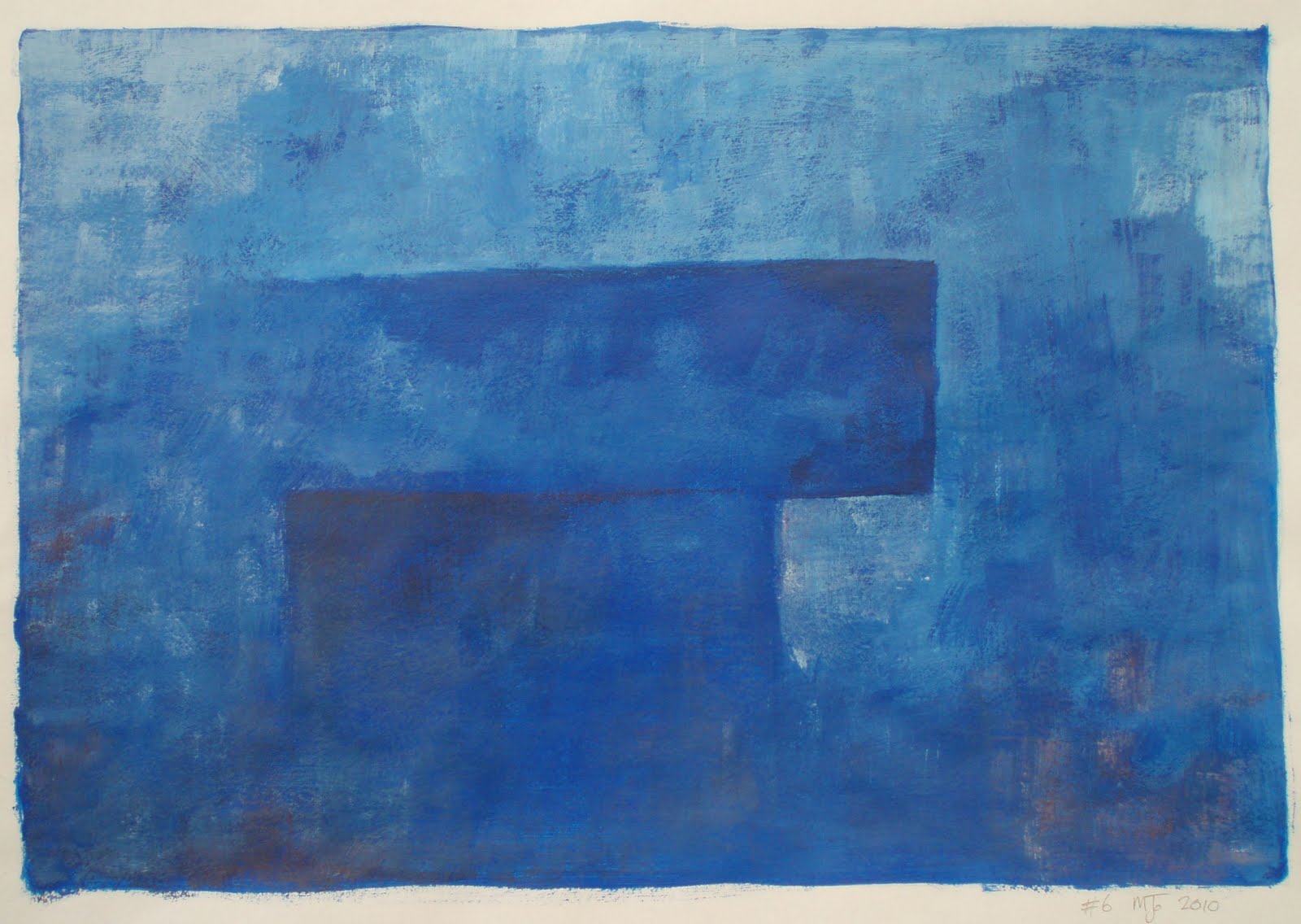
#6 Modern abstract painting in blue

Following on from the previous painting (painting #5) I again set out with no clear idea of what I wanted to paint other than a basic notion. Painted quickly as a simple monochrome painting of blue acrylic paint allowing myself half an hour to complete the piece. However I soon felt that the painting needed some definition and  added a touch of red to deepen shade and provide contrast. The broken finish is a result of the hasty brushwork but seams to add to the overall feel of the piece.

#6 Modern abstract painting
9 x 13 inches approx
Acrylic paint on paper

Sunday, March 28, 2010

Acrylic on paper

A simple abstract modern painting exploring shape and form. This painting was taken from a rough sketch in one of my books, that I have not had the courage to commit to canvas as yet. The simple fact is that I was intimidated by the amount of space within the picture and yet its simplicity and visual openness seams to work very well… I have got to overcome these innate fears of mine!

This art project is all about overcoming fears and exploring ideas and if I consider the results of this piece alone then I am already one step closer to being a better artist and painter…
#4 Modern abstract painting
Acrylic paint on paper 9 x 9 inches approx
Painted in blues because that is what I had out at the time and this seamed to feel right, I allowed myself an hour to complete the painting, nevertheless I overran by 15 minuets but I am not going to kick myself for that, as I think that it works quite well, but on reflection I think it needs a touch of colour perhaps red? And some more exploration as an idea or concept.

This is one of a number of sketches Drawn after stopping at a Neolithic walkway we found on Dartmoor on a cold wet misty day a few years ago. I have tried to capture the feel of the long lines of standing stones, fallen, missing, buried, large and small. The magic and mystery that these ancient places seam to hold is at time quite breathtaking, when one considers that they possessed none of the machinery or technology that we so often take for granted today.

the first painting

#1 Abstract modern art
Acrylic on paper 9 x 9 inches approx
This is the first painting of my ongoing artist project, painted as a monochrome painting in acrylics with a rapid and broken finish, as I had set myself a shot time frame to complete the piece of half and hour.  I do not normally like painting with acrylic paint as find the rapid drying time a distant limitation, however with this artwork I used this to my advantage allowing each layer to semi-dry and become tacky so as when the bush was drawn across the surface new colour was picked up creating a sense of depth and movement.

Monochrome painting forms a valuable part of modern avant-garde in art movements right through the 20th century, like Abstract Expressionist and Minimalism.  Artists and painters use the single colour monochrome style as a means to convey a variety emotions, sense and value that such painting can provoke through the play of light and texture.

This simple painting technique is both subtle and dramatic way to consider the emotional value of colour on the human psyche, that any artist or painter regardless of skill can employ to create a high impact painting. however to truly understand and execute a monochrome takes some expertise and knowledge.

For further study take the time to look at the work and motives of artists such as Rodchenko, Kazimir Malevich, Ad Reinhardt and Yves Klein to list just a few of the artist who have produced notable monochrome paintings.