outside the frame is thinking about and making art “outside the box” By exploring art and experimenting with media, paints, styles and technique

Thursday, June 10, 2010

Making better modern art

Making abstract and modern art better is as much about understanding the deeper meanings and concepts that modern art has to offers us. Abstract painting or sculpture is often a question of exploring experiences, ideas and notions rather than realities which make painting the abstract far more versatile and volatile.

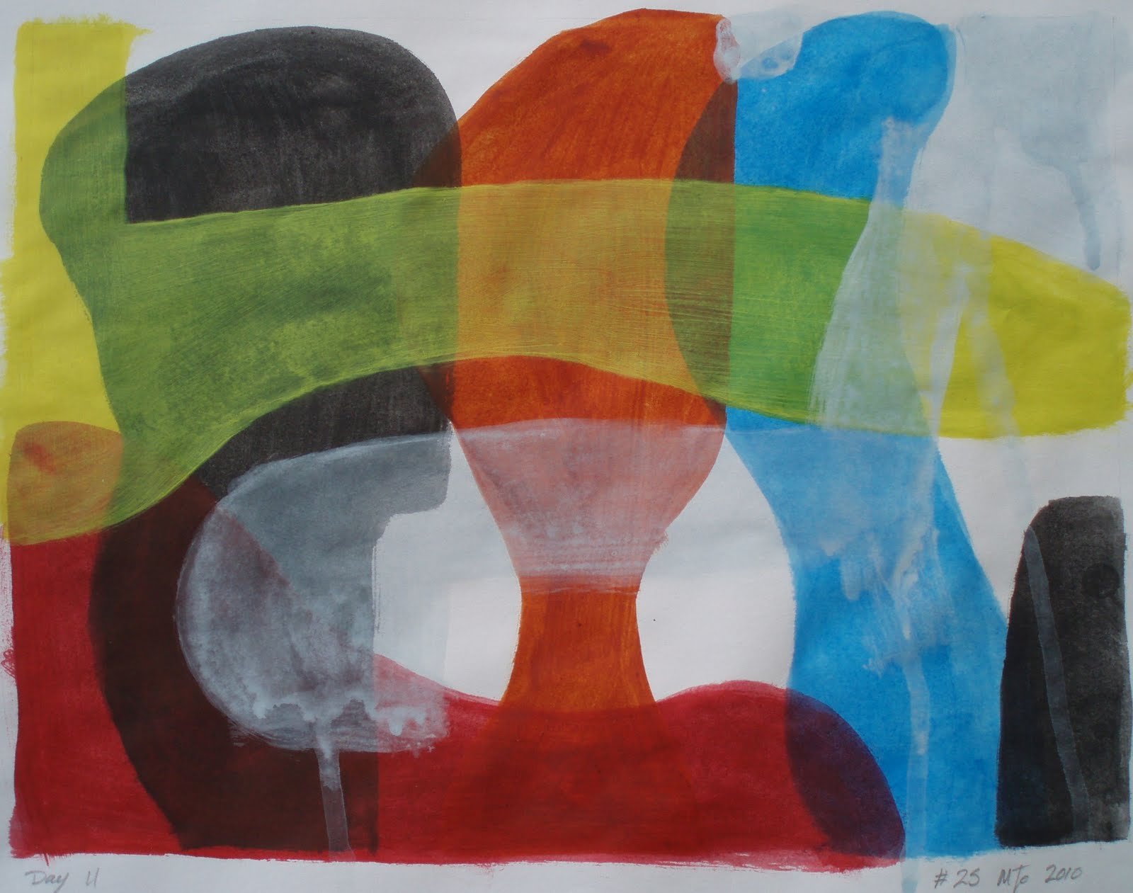
This piece was one of the studies that I conducted in to the painting style made famous by the abstract expressionist artist Jackson Pollack. I added the black acrylic paint with a coffee stirrer as I had in the previous piece However this time I had applied an even colour of yellow ochre to the surface first but I was disappointed with the overall effect as it just did not have the energy and excitement I was looking for even after I added  some white. It still felt flat and lifeless.

After some consideration I made what I feel is a bold decision for myself by cutting or puncturing the painting. As an artist I think ( like many artists ) the very notion of damaging the painting surface itself in such a dramatic way seems almost appalling, However when we consider that the very act of painting is in itself an act of destruction in a sense, it did make the decision easier to live with at a personal level.  

I have over the years seen a number of painting that have been damaged by the artists, including a number of pieces by Lucio Fotane at the Tate some time ago, which I have to admit that I did not fully understand at the time and for this reason I had made Spatial concept number 42 on my list of 50 interesting painting methods to explore, as an artist I wonted to overcome my own objections and develop a better understanding Spatialism.

 #27 acrylic paint on paper 9 x 9 inches approx
paint splattered, dripped and applied to paper with punctures

What is Spatial concept ?
The conceptual artist Lucio Fontana from Argentina began cutting, puncturing, slashing and scratching the picture surface or plane in the late 1940’s and early 1950‘s.   In these pieces he described as “Spatial concept” and said  “I have constructed, not destroyed “ despite the apparent violence that one might expect from such an act. However Fontana sought to break away from the easel and paint creating art for a “new age” that showed the "real space of the world," as he perceived it.

The word Spatial is derived from the Latin word “spatial,” meaning “space” and  is used to describe things relating to size and position rather than to time. Lucio Fontana  practiced style of perforations, cuts and scratches to the picture allowed him as an artist to explore the three-dimensional rather than the just two-dimensional surface of a painting in a deliberate and considered way.

The spatial art  movement draws on aspects of the Dada, Tachism and Concrete art movements from the 1920’s and 1940’s and although not fully an abstract expressionist art movement it can be conceded to be related as it developed at about the same time, however it differs in a number of ways as spatial art and rejects the paint and easel that abstract expressionist art embraces but instead seeks to capture both movement and time within the act of the work itself. The very act of cutting the canvas frees the artist and pushes the canvas itself into the space of reality.

This was my first foray into this particular aspect of modern conceptual art and despite my deep initial uncertainties I was both surprised and delighted with the effect and the wealth of understanding that such a simple act as cutting the painting surface allowed me. I personally feel that the insight gained from this specific and expressive artistic technique will led me to making better modern art.

I have included some of the links that I used in researching this article which thought might be a good starting point should you wish to learn more about  Spatial concept or modern abstraction in art.  Thank you for leaving your valued comment which are always appreciated

Wikipedia/Spatialisam
The Tate.org
MOMA.org
Blurtit.com

Saturday, June 5, 2010

modern artistic movements of the 20th century. Jackson Pollack’s and his method of action painting

I have to some extent become almost obsessed with Jackson Pollack’s work and his method of action painting, which, much to my surprise I did not anticipate. That is not to say that I am a big fan of this style of drips and splash painting.  Far from it.. Its much more that I did not expect to find that such a degree of control and planning is required in this particular painting technique.  I must admit that I had always seemed to consider that such an apparently simple means of applying paint would be simple and straight forward requiring little skill, thought or consideration.

I had formally believed that such a simplistic approach would on accidental occasions produce work that could be considered of value. However I now understand that to paint in such a way needs control, consideration and planning to produce and execute abstract expressionist paintings that can be fully appreciated and understood. I feel this has enhanced the value that Jackson Pollack and others have added to the modern artistic movements of the 20th century. This movement has produced paintings that we can all realize have redefined modern and abstract art for the benefit of artists and art lovers all over the world.   


I had set myself a challenge with this style of abstract expressionist painting by limiting myself to painting on such a small scale of 9 x 9 inches.  Pollack’s painting are often on a large scale even his early works and sketches are somewhat larger than this, being painted on larger sheets of brown paper like you would use to wrap parcels and such a like.  In these he used limited colours of black, white and ochre’s ( yellow and red) with the occasional use of blue in drips, splashes, smudges and marks. 

Perhaps Jackson used brown paper because it was cheep and plentiful, which might well be true. However the contrasts that such a surface provided, to my mind enhanced these early studies and after some consideration I decided to explore this by using a coloured surface myself. Lacking at the time large sheets of brown paper I chose to pre-paint the area with Yellow ochre mixed with white creating a patchy and broken finish that I could then create my image on. Using w a wooden coffee stirrer  with a mixed black acrylic paint I loosely made a number of marks and drips before making the flicks and twists across the painting. I had made a decision to make these in a linier fashion as an attempt to contrast with the circular motif.  

#26 acrylic paint on paper 9 x 9 inches approx
paint splattered dripped and applied to paper
Like my previous studies in to this particular painting technique ( #21 or #22 ) or with any other style and methods of abstract expressionist painting it is a liberating experience that is as much about self discovery as it is about painting. Freeing the mind and allowing the paint to flow in ways that are difficult to describe. I often feel that as an artist I am left to consider these effects, rather than create them. However this is not the whole truth, as whilst in the act of painting you are making conscious and subconscious decisions about the direction that the piece will follow as does the paint, seemingly by its own volition the paint ends up just where you desired. 

This seemingly random action on reflection is not as random as you might think. That being the case, it poses far deeper questions about the will, purpose and influence that we as individuals can excerpt on the world around us and the paint we flick around.


thank you for leaving your valued comment which are always appreciated

Saturday, May 29, 2010

Colours competing for attention

On occasions It gets noisy in my house once in awhile what with all the girls shouting and making a fuss all trying to be heard over the din of the others…it is like Colours competing for attention I escaped to the relative sanctuary of my studio only to find it following me… Gerrrrr… as a result I took several deep breaths and calmed myself as I started this piece.

Using acrylic paints applied to paper in thin washes, with only a rough idea in my head  I painted bold shapes that overlapped. As much as anything I was exploring the media and the colour vials that resulted. It did not quite work as planed that’s not to say I had a plan only the paint did not run or drip as I expected. I was also disappointed with the coverage and the relative blandness of the paint… Almost as frustrating as living in a house full of women. But that however is my choice I suppose.


Colours competing for attention
#25 acrylic paint on paper 9 x 12 inches approx

That is not to say that I do not think that this is a successful painting It’s just that I was struggling with the media more than I would if I had been using oil paint. Please let me know what you think.

Wednesday, May 26, 2010

Art is an act of destruction

Making Art is in essence a process of destruction! In effect changing one image to create another means destroying the previous image. One way to do this is to distressed/damage the painting which forms number 30 on my list of simple and interesting painting ideas. In this case I splashed household bleach over Marker pen and acrylic paints. The effects where both interesting and unexpected. The bleach did not behave quite the way that I had envisioned in some places it fully bleached the paint while in others it just altered the colour or had limited effect while on the marker pen it left a brown stain of varying degrees. 
 

#23 9 x 9 inches approximately 
Marker pen and acrylic paint painted on paper


#24 Ink and acrylic paint on paper   
9 x 9 inches approx, Mixed-media on paper


In the piece (#24) I used Marker pen, conté crayon, charcoal, acrylic paint, oil pastel and bleach. In the areas that I applied conté crayon or charcoal I found that these media did not adhere to the surface, remaining lose and unstable.  Like  #23 I had made a decision to distress the paint with bleach, which had some unexpected results. The bleach is difficult to control as the effects are uneven and varied but interesting and worthy of further investigation.

Note: the bleach not only affected surface but permeated through to up to 5 sheets of paper below altering the colour and texture of the paper itself.

please leave a valued comment which is always appreciated thank you!

Tuesday, May 25, 2010

exploring Jackson Pollack’s early abstract expressionism work

As with the previous piece (#21 link) I continued exploring Jackson Pollack’s  early work however I chose to add some colour this time, but I now think the blue is a tad to bright still.. This piece dose seam to work quite well despite that.
The Ink and acrylic paints were applied to paper with a wooden coffee stirrer as dips, splashes and marks in a seemingly random manor and allowed to run or flow.
 #22  Ink and acrylic paint on paper 9 x 9 inches approx
What is most suppressing is that to paint in this style of abstract expressionism requires a degree of restraint.  Designed or controlled application of paint is much harder to achieve than one would expect as it is not just a question of splashing or dripping paint to create an effect but rather making a subconscious decision about what you require and allowing the paint to work for you… As you can appreciate this is quite a departure from the traditional painting methods of controlling the Paint to create an effect.  I found this style of abstract expressionist painting very liberating if a little frightening.

Please feel free to leave your valued comment which are always appreciated thank you

Friday, May 21, 2010

drip and splash technique of painting like Jackson Pollack’s early work

Some years ago I remember seeing some of Jackson Pollack’s early work in the Guggenheim in New York which seamed at the time to make a lot of sense of the abstract style of painting that he employed. Just seeing his later works alone I had always struggled to find any understanding and had been quite dismissive of this style of drip and splash technique of painting. As a result I thought it might be a good idea to explore his work and this style of Painting in more detail and this piece I feel explores it quite well.

#21 9 x 9 inches approx
Ink painted and splashed on paper

The Ink was applied to paper with a wooden coffee stirrer ether directly or as dips and splashes and despite what on the surface might appear simple and child like it proved far more complex and difficult as controlling the media leaves you with a deep feeling of frustration and fear that it will just end up being a confusing mess.

The circular motif is also a departure for me form my normal angular style and is reminiscent of a happy face that despite its obvious monotone application brims with colour and energy. Please feel free to leave your valued comment which is always appreciated Thank you.

Sunday, May 9, 2010

Ink painted on paper

I don’t normally use inks in art however in this case I felt that it was about time I made some efforts to try this medium. As with all permanent markers be that ink or pen there is a need to be confident and decisive in their use… as mistake and errors are difficult to rectify.

As you can see I chose to use a complex and difficult image to start this study in inks, by using a photo for the basis of my subject. I must admit that I initially struggled with this piece but found it very rewarding even if it did take longer than expected. Using a brush I applied thin layers of ink to the wet paper, without any initial drawings or outline. I used a normal writing Ink rather than artist inks which I did find most refreshing and was surprised by the range of colour that this black ink produced ranging from brown, blue and varying shades of grey. This however was difficult to control despite playing with varying levels of dilution and layers. please feel free to leave your valued comment which are always appreciated.

#18, Ink on paper, 9 x 9 inches approx
Ink painted on paper