outside the frame is thinking about and making art “outside the box” By exploring art and experimenting with media, paints, styles and technique

Saturday, May 29, 2010

Colours competing for attention

On occasions It gets noisy in my house once in awhile what with all the girls shouting and making a fuss all trying to be heard over the din of the others…it is like Colours competing for attention I escaped to the relative sanctuary of my studio only to find it following me… Gerrrrr… as a result I took several deep breaths and calmed myself as I started this piece.

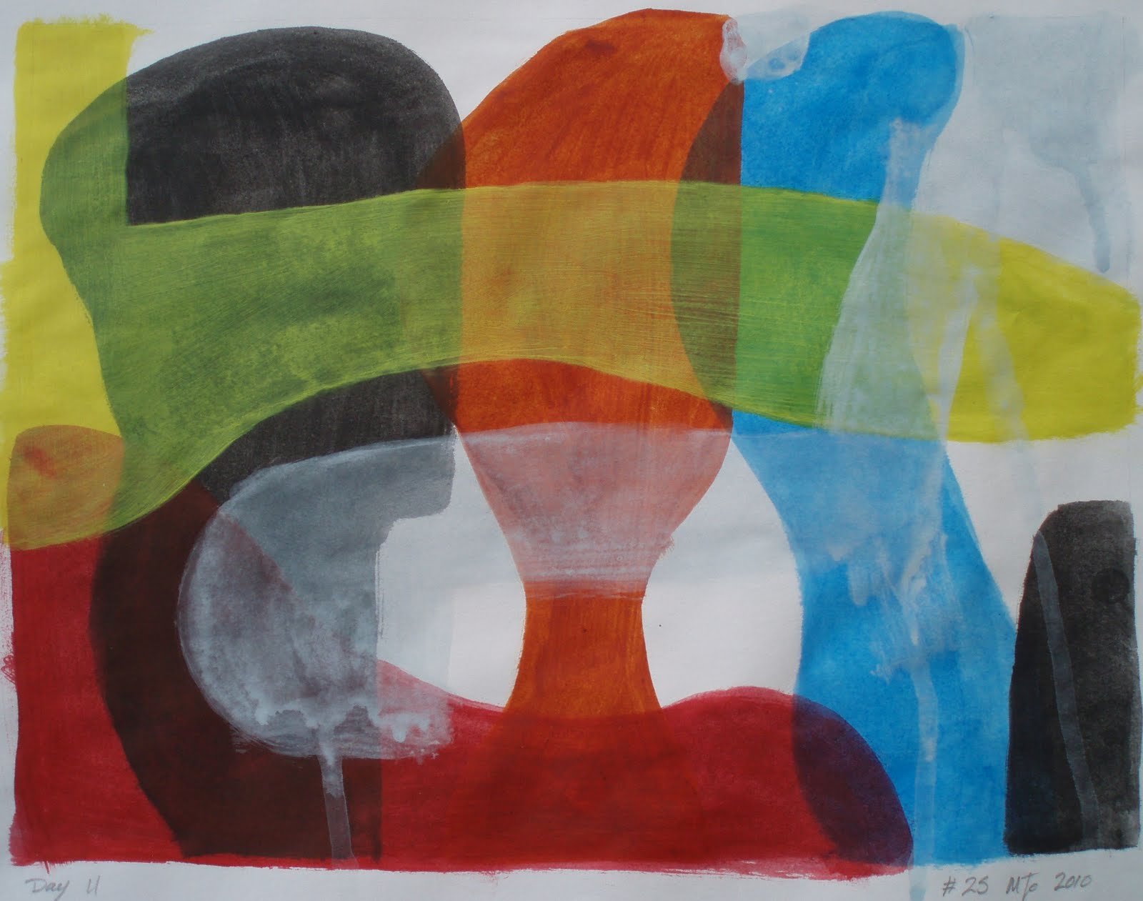
Using acrylic paints applied to paper in thin washes, with only a rough idea in my head  I painted bold shapes that overlapped. As much as anything I was exploring the media and the colour vials that resulted. It did not quite work as planed that’s not to say I had a plan only the paint did not run or drip as I expected. I was also disappointed with the coverage and the relative blandness of the paint… Almost as frustrating as living in a house full of women. But that however is my choice I suppose.


Colours competing for attention
#25 acrylic paint on paper 9 x 12 inches approx

That is not to say that I do not think that this is a successful painting It’s just that I was struggling with the media more than I would if I had been using oil paint. Please let me know what you think.

Wednesday, May 26, 2010

Art is an act of destruction

Making Art is in essence a process of destruction! In effect changing one image to create another means destroying the previous image. One way to do this is to distressed/damage the painting which forms number 30 on my list of simple and interesting painting ideas. In this case I splashed household bleach over Marker pen and acrylic paints. The effects where both interesting and unexpected. The bleach did not behave quite the way that I had envisioned in some places it fully bleached the paint while in others it just altered the colour or had limited effect while on the marker pen it left a brown stain of varying degrees. 
 

#23 9 x 9 inches approximately 
Marker pen and acrylic paint painted on paper


#24 Ink and acrylic paint on paper   
9 x 9 inches approx, Mixed-media on paper


In the piece (#24) I used Marker pen, conté crayon, charcoal, acrylic paint, oil pastel and bleach. In the areas that I applied conté crayon or charcoal I found that these media did not adhere to the surface, remaining lose and unstable.  Like  #23 I had made a decision to distress the paint with bleach, which had some unexpected results. The bleach is difficult to control as the effects are uneven and varied but interesting and worthy of further investigation.

Note: the bleach not only affected surface but permeated through to up to 5 sheets of paper below altering the colour and texture of the paper itself.

please leave a valued comment which is always appreciated thank you!

Tuesday, May 25, 2010

exploring Jackson Pollack’s early abstract expressionism work

As with the previous piece (#21 link) I continued exploring Jackson Pollack’s  early work however I chose to add some colour this time, but I now think the blue is a tad to bright still.. This piece dose seam to work quite well despite that.
The Ink and acrylic paints were applied to paper with a wooden coffee stirrer as dips, splashes and marks in a seemingly random manor and allowed to run or flow.
 #22  Ink and acrylic paint on paper 9 x 9 inches approx
What is most suppressing is that to paint in this style of abstract expressionism requires a degree of restraint.  Designed or controlled application of paint is much harder to achieve than one would expect as it is not just a question of splashing or dripping paint to create an effect but rather making a subconscious decision about what you require and allowing the paint to work for you… As you can appreciate this is quite a departure from the traditional painting methods of controlling the Paint to create an effect.  I found this style of abstract expressionist painting very liberating if a little frightening.

Please feel free to leave your valued comment which are always appreciated thank you

Friday, May 21, 2010

drip and splash technique of painting like Jackson Pollack’s early work

Some years ago I remember seeing some of Jackson Pollack’s early work in the Guggenheim in New York which seamed at the time to make a lot of sense of the abstract style of painting that he employed. Just seeing his later works alone I had always struggled to find any understanding and had been quite dismissive of this style of drip and splash technique of painting. As a result I thought it might be a good idea to explore his work and this style of Painting in more detail and this piece I feel explores it quite well.

#21 9 x 9 inches approx
Ink painted and splashed on paper

The Ink was applied to paper with a wooden coffee stirrer ether directly or as dips and splashes and despite what on the surface might appear simple and child like it proved far more complex and difficult as controlling the media leaves you with a deep feeling of frustration and fear that it will just end up being a confusing mess.

The circular motif is also a departure for me form my normal angular style and is reminiscent of a happy face that despite its obvious monotone application brims with colour and energy. Please feel free to leave your valued comment which is always appreciated Thank you.

Sunday, May 9, 2010

Ink painted on paper

I don’t normally use inks in art however in this case I felt that it was about time I made some efforts to try this medium. As with all permanent markers be that ink or pen there is a need to be confident and decisive in their use… as mistake and errors are difficult to rectify.

As you can see I chose to use a complex and difficult image to start this study in inks, by using a photo for the basis of my subject. I must admit that I initially struggled with this piece but found it very rewarding even if it did take longer than expected. Using a brush I applied thin layers of ink to the wet paper, without any initial drawings or outline. I used a normal writing Ink rather than artist inks which I did find most refreshing and was surprised by the range of colour that this black ink produced ranging from brown, blue and varying shades of grey. This however was difficult to control despite playing with varying levels of dilution and layers. please feel free to leave your valued comment which are always appreciated.

#18, Ink on paper, 9 x 9 inches approx
Ink painted on paper